flowchart LR
  A(Analyses) -.-> B(Frequencies) -.-> C(Contingency Tables \nIndependent Samples \nx<sup>2 </sup> test of association)
18 LAB VIII: Inference for categorical data
When we have finished this Lab, we should be able to:
18.1 Introduction
If we want to look at the association between two categorical variables then we can’t use the mean or any similar statistic because we don’t have any variables that have been measured continuously. Therefore, when we have measured categorical variables, we analyze frequencies. That is, we analyze the number of subjects that fall into each combination of categories. We can tabulate these frequencies and this is known as a cross-tabulation table or a two-way table or a contingency table.
18.2 Chi-square test of independence
If we want to see whether there’s an association between two categorical variables we can use the chi-square test, often called chi-square test of independence. This is an extremely elegant statistic based on the simple idea of comparing the frequencies we observe in certain categories to the frequencies we might expect to get in those categories by chance.
Opening the file
We will use the “Survival from Malignant Melanoma” dataset named “meldata”. The data consist of measurements made on patients with malignant melanoma, a type of skin cancer. Each patient had their tumor removed by surgery at the Department of Plastic Surgery, University Hospital of Odense, Denmark, between 1962 and 1977.
Open the dataset named “meldata” from the file tab in the menu:
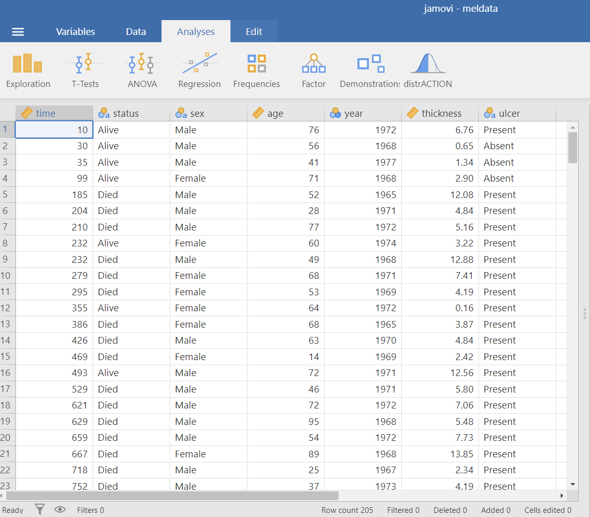
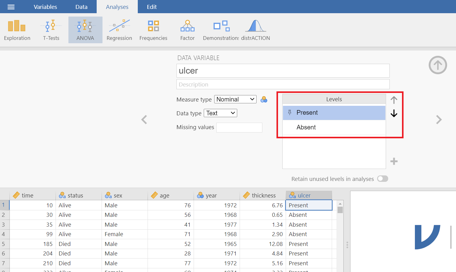
The dataset “meldata” includes 205 patients and has seven variables. We are interested in association between the binary variables ulcer (Absent/Present) and satus (Alive/Died)(Figure 18.1).
Research question
We are interested in the association between tumor ulceration and death from melanoma.
Hypothesis Testsing for the Pearson’s Chi-square test of independence
Assumption
Explore the data with plots and tables
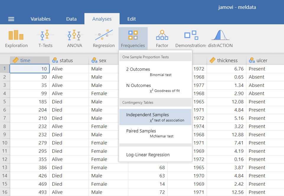
On the Jamovi top menu navigate to
as shown below in ?fig-chi0.
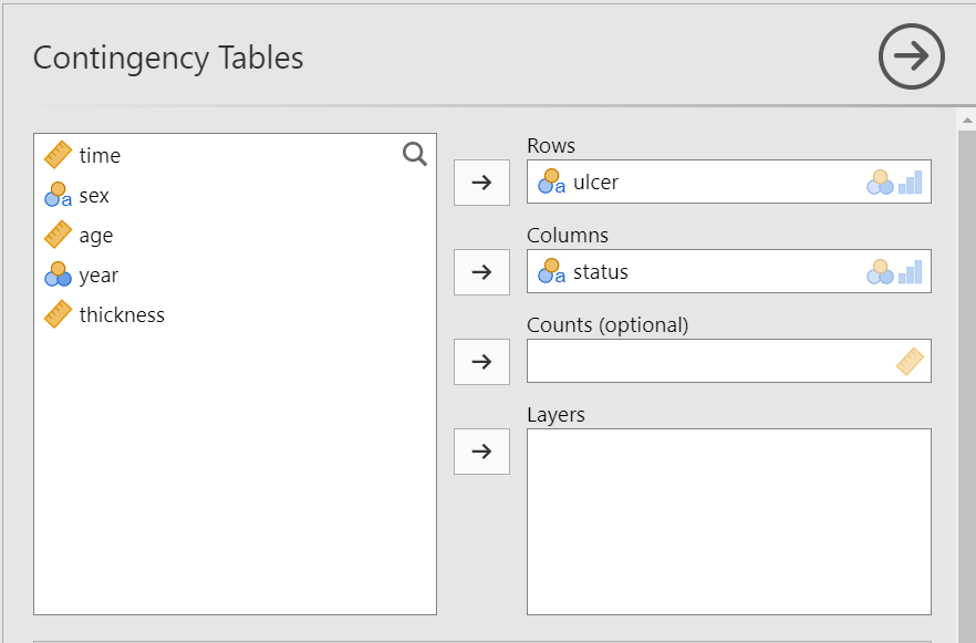
The Contingency Tables dialogue box opens. Drag the variable ulcer into the Rows field and the variable status into the Columns field, as shown below (Figure 18.2):
A. Stacked bar plot
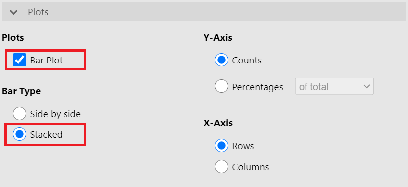
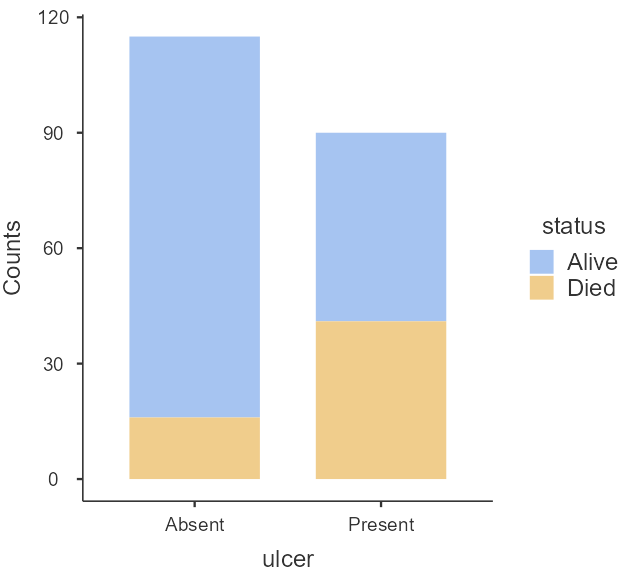
First, it is useful to plot the data as counts. In the Plot section, check the Bar Plot and Stacked bar type, as shown below (Figure 18.3):
A bar plot is generated in the output on our right-hand side, as shown below (Figure 18.4):
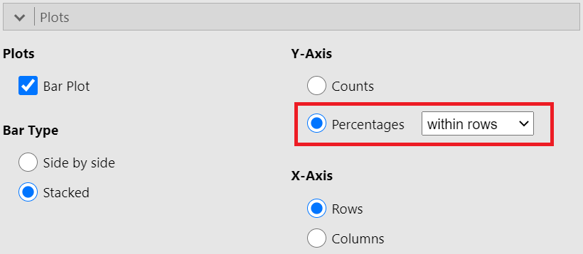
In practice, it is percentages we are comparing. Let’s create a stacked bar plot with percentages. In the Plot section, now, check the Percentages and within rows, as shown below (Figure 18.5):
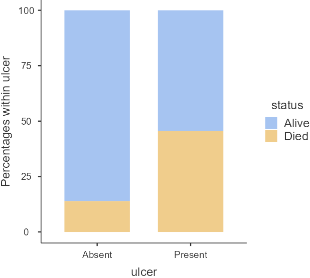
Just from the plot in Figure 18.6, death from melanoma in the ulcerated tumor (Present) group is around 45% and in the non-ulcerated (Absent) group around 15%. The number of patients included in the study is not huge, however, this still looks like a real difference given its effect size.
B. Contingency Table
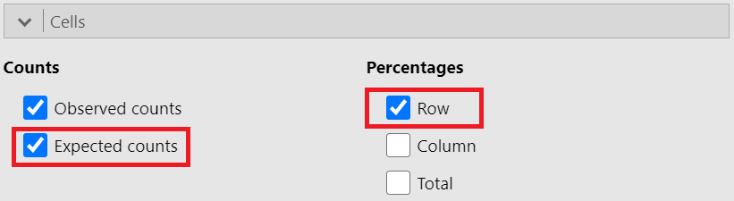
We will create a contingency 2x2 table with row percentages and the expected counts for the binary variables ulcer (Absent/Present) and satus (Alive/Died). In the Cells section, tick the Row and Expected counts boxes, as shown below (Figure 18.7):
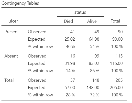
We present the generated contingency table in Figure 18.8:
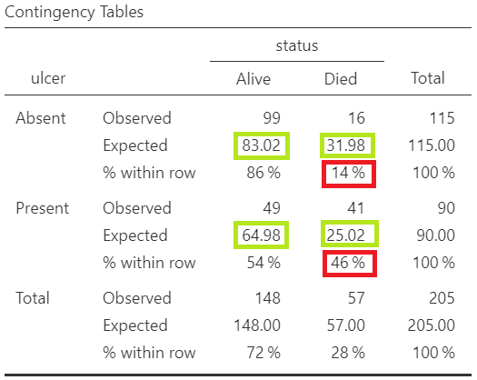
From the raw frequencies, there seems to be a large difference, as we noted in Figure 18.6. The proportion of patients with ulcerated tumors who die equals to 46% compared with non-ulcerated tumors 14%.
Additionally, as we observe in Figure 18.8 the assumption of chi-square test is fulfilled (all the expected counts are greater than 5; green cells).
Chi-square test
Chi-square test
Finally, we see the results of the chi-square test.
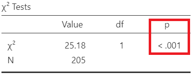
Since p<0.001, there is evidence for an association between the ulcer and status (reject \(H_0\)).
Interpretation
There is evidence for an association between the ulcer and status (reject \(H_0\)). The proportion of patients with ulcerated tumors who died (46%) is significant larger compared with non-ulcerated tumors (14%) (p-value <0.001).
18.3 Risk ratio (RR) and Odds ratio (OR)
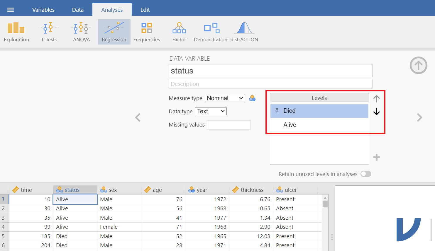
First we need to reshape the contingency table. Double click on the variable name ulcer and change the order of levels using the (up/down) arrows as follows (Figure 18.10):
Similarly, change the order of levels for the variable status (Figure 18.11):
The reshaped table follows:
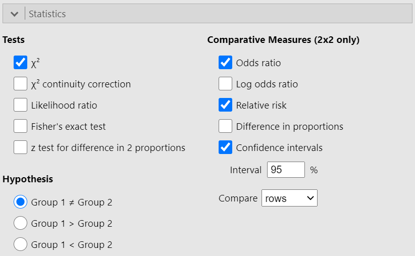
In the Statistics section, check the Relative risk, Odds ratio and Condidence intervals boxes, as follows (Figure 18.13):
Risk ratio (or relative risk)
First, we calculate the risk ratio (RR) of the 2x2 table in Figure 18.12 by hand:
\[ Risk \ Ratio = \frac{\frac{41}{90}}{\frac{16}{115}} =\frac{0.4556}{0.1391} = 3.27\] Using Jamovi we get the following output (Figure 18.14):
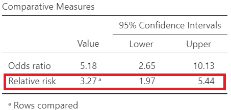
The risk of dying is 3.27 times higher for patients with ulcerated tumors compared to non-ulcerated tumors. Note that the 95% confidence interval of the RR (1.97, 5.44) does not include the hypothesized null value of 1.
Odds Ratio
Next, let’s calculate the odds ratio of the 2x2 table in Figure 18.12 by hand:
\[ Odds \ Ratio = \frac{\frac{41}{49}}{\frac{16}{99}} =\frac{0.837}{0.162} = 5.18\]
Using Jamovi we get the following output (Figure 18.15):
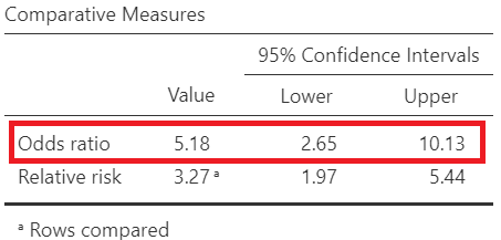
The odds of dying is 5.18 times higher for patients with ulcerated tumors compared to non-ulcerated tumors patients. Note that the 95% confidence interval of the OR (2.65, 10.13) does not include the hypothesized null value of 1.