14 LAB IV: Estimation and Confidence Interval
When we have finished this Lab, we should be able to:
14.1 The Sampling Distribution of mean and the Central Limit Theorem (CLT)
In this Lab we will learn the Central Limit Theorem (CLT), which is the basis for many statistical concepts. We are going to explore this concept with the help of a Shiny application. So, clink on the following link CLM.
A Shiny app opens in a web window as shown below (Figure 14.1):
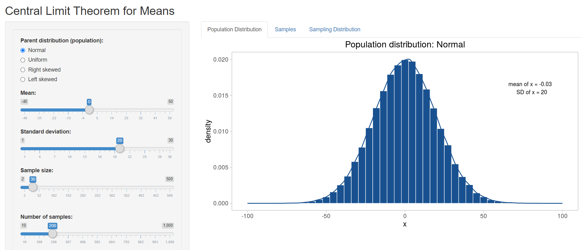
To the left is the interactive panel with radio buttons and slider bars, and to the right there are three tabs: Population Distribution, Samples, and Sampling Distribution.
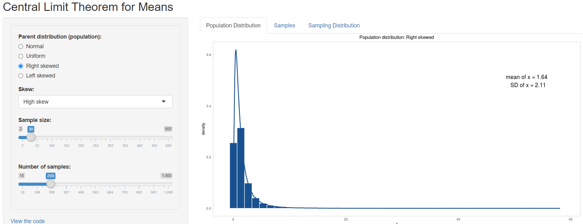
First we are asked to choose from a Normal, Uniform, Right Skewed or Left Skewed Population distribution (Parent distribution) from the left panel. Let’s select Right skewed and then High skew from the drop down menu with the name Skew (Figure 14.2).
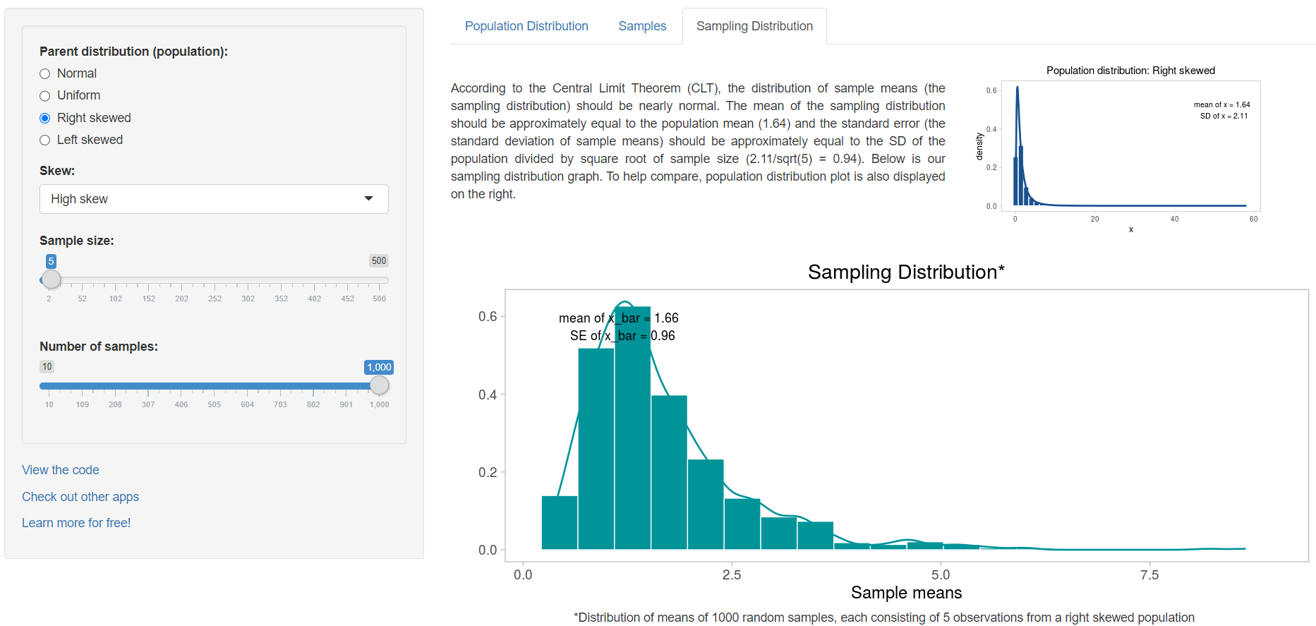
Next we set the value of the Sample size slider bar to 5 and the Number of samples to 1000 and we select the Sampling distribution tab. We observe that the sampling distribution is right skewed with mean approximately equal to population mean (Figure 14.3).
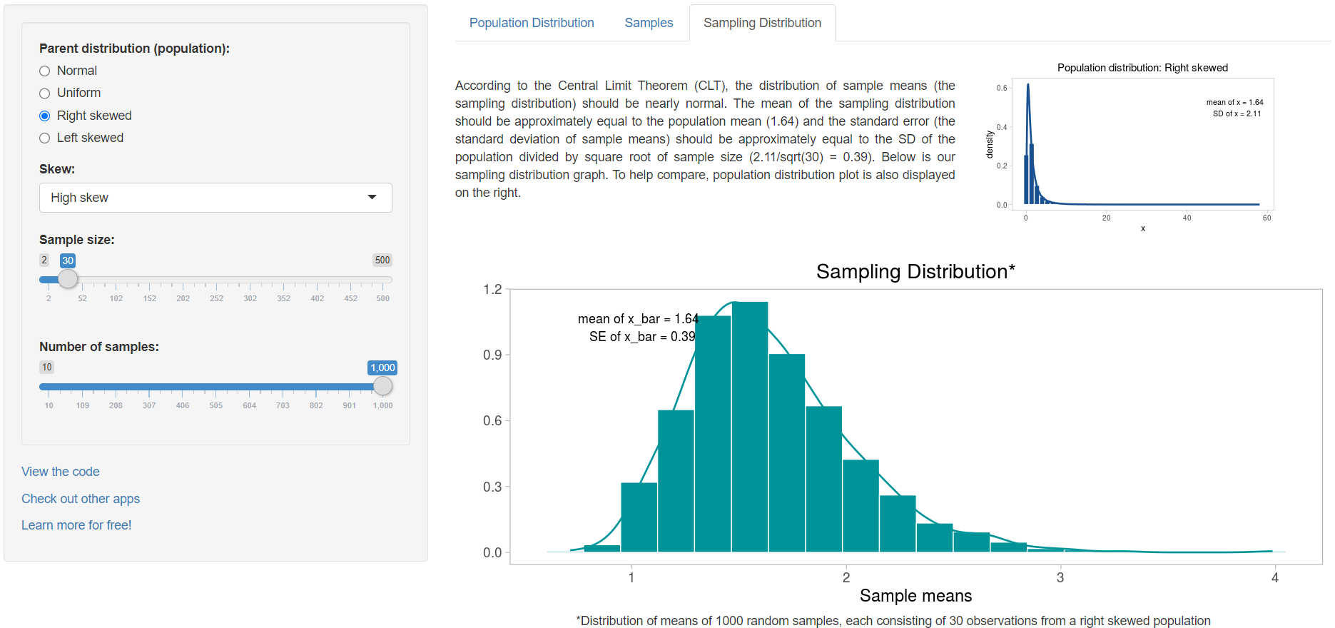
Now, try to increase the sample size to 30 (Figure 14.4):
and then increase it to 200 (Figure 14.5):
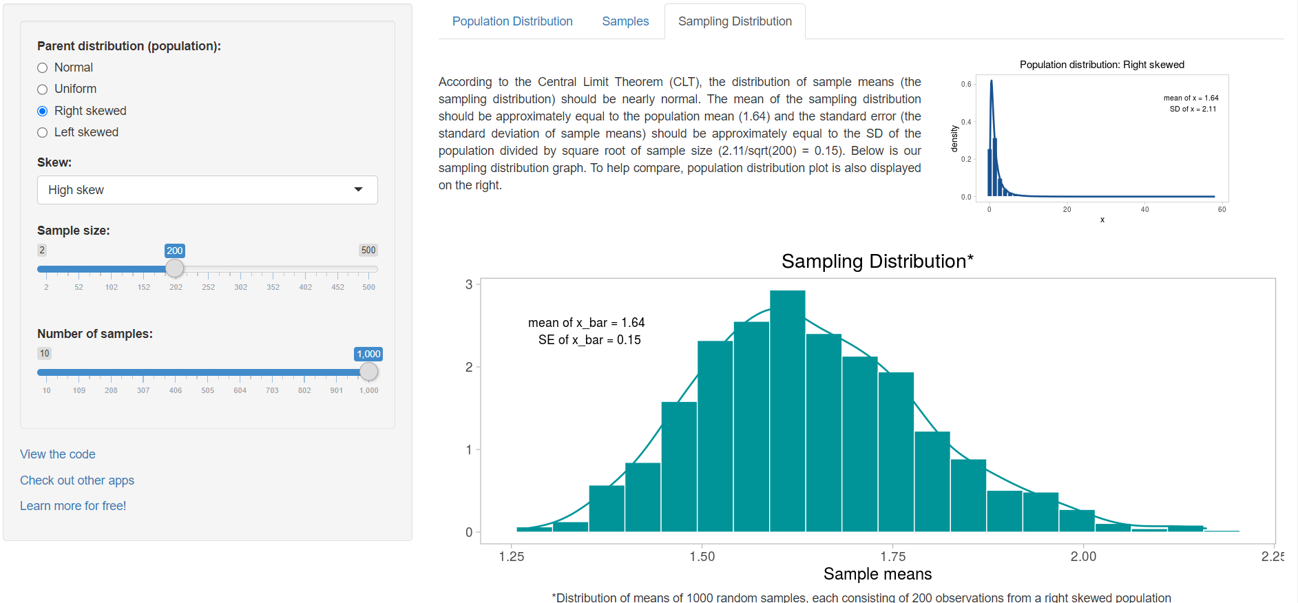
We observe that the sampling distribution becomes closer and closer to Normal and the standard error of the mean, SE, (the standard deviation of sample means) gets smaller as the sample size increases. The important point is that whatever the parent distribution of a variable, the distribution of the sample means will be nearly Normal, as long as the samples are large enough.
14.2 The confidence interval of mean
We are going to explore the concept of confidence interval (CI) of mean with the help of a Shiny application. So, clink on the following link CIs.
A Shiny app opens in a web window as shown below (Figure 14.6):
To the left is the interactive panel with radio buttons and drop down menus, and to the right there are two tabs: Plots and About.
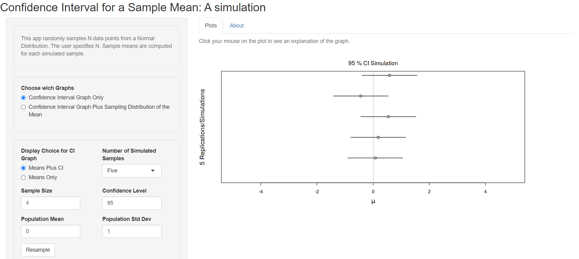
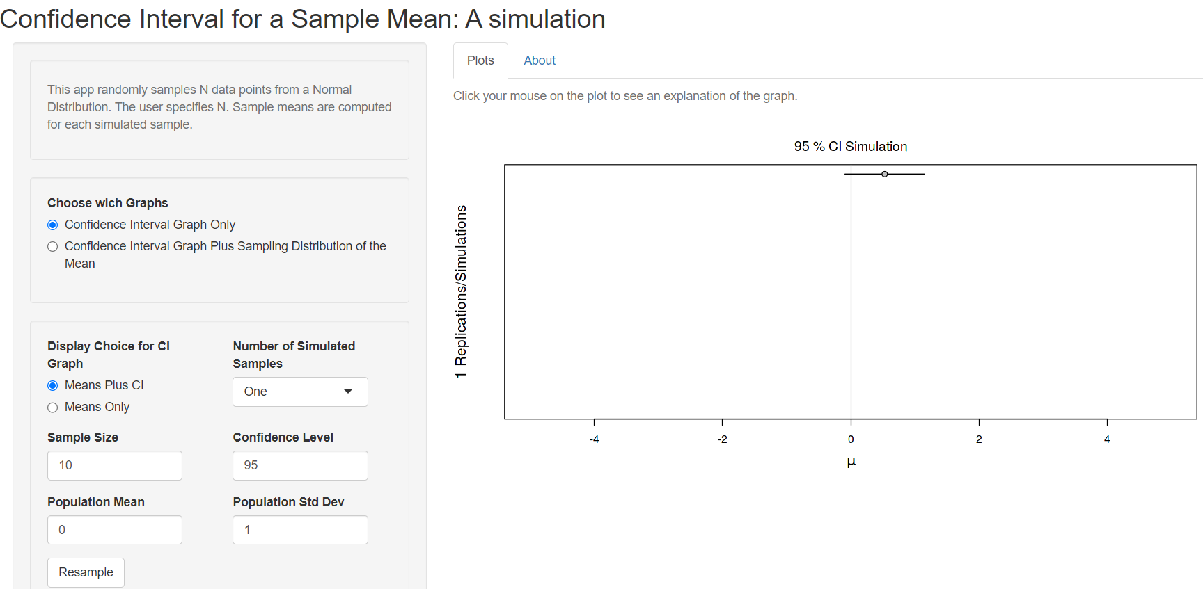
First we are asked to choose if we want the Confidence Interval Graph only or the Confidence Interval Graph Plus Sampling Distribution of the Mean. Let’s select the first choice and set the value of the Number of Simulated Samples to one and the Sample Size to 10 from the drop down menus (Figure 14.7).
We observe at the Plot tab that a horizontal bar has been created which represents the confidence interval (CI), centered on the sample mean (point). In this case, the 95%CI for the sample mean includes the true value of the population mean (it crosses the solid vertical line) and it is drawn as a black line (Figure 14.7).
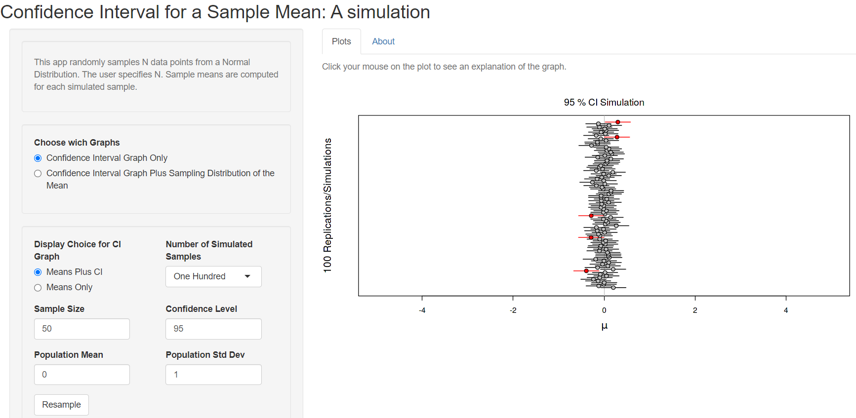
Now, try to increase the Number of Simulated Samples to 100 (Figure 14.8):
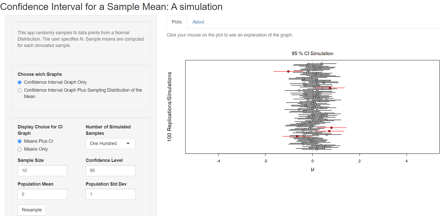
We observe that 5 out of 100 confidence intervals (red horizontal lines) do not include the true population mean (the solid vertical line) (Figure 14.8). This is what we would expect – that the 95% confidence interval will not include the true population mean 5% of the time.
Next, we create the confidence intervals of 100 randomly generated samples of size = 50 from the population (Figure 14.9):
We observe that the sample means are closer to the true population mean and the 95%CIs of the mean become narrower (Figure 14.8) increasing the sample size.