8 Inference for categorical data
Chapter’s author: Constantine Giannoutsos
8.1 Introduction
Different data types require different analytical approaches. In the previous chapters we discussed a number of ways to analyze and extract conclusions from continuous data [give some examples here]. Here we look at ways to perform analyses involving categorical data. “Categorical” are data where each observation implies membership to some group. For example, categorical data can be string of character values such as ‘M’ or ‘F’, dictating whether a person’s sex is male or female, or they can be numbers, such as 1, 2 or 3, symbolizing smoking status (where 1 might represent current smokers, 2, previous smokers and 3 people who never smoked). In medical research, categorical data frequently take on the form of membership in a response category (e.g., 1 for responders and 0 for non-responders), or exposure to some risk factor (e.g., 1 for exposed and 0 for not exposed), the occurrence of disease and so on.
When recording categorical data it is good practice to use numbers representing each category or group and then assigning a label to each number. The reason for this is that, unlike character values, numbers are, barring data entry error, virtually impossible to misspell. For this reason, all software packages include routines that assign labels to numbers which represent membership in some group. Here is an example, where we create a variable called smoking, which contains codes of the smoking status of 10 individuals:
Coded data: 1, 2, 3, 3, 2, 1, 1, 2, 3, 3
where 1= Current, 2= Previous, and 3= Never.
(Labeled data: Current, Previous, Never, Never, Previous, Current, Current, Previous, Never, Never)
It is crucial to understand that, while using numbers to represent membership in some category, the numbers are labels and not actual numerical data. In other words, non-smokers do not have three times and previous smokers two times the value of current smokers! On the other hand, numbers are useful, both because of accuracy but also as labels of group membership when the data are ordinal. Ordinal are categorical data where there is an inherent ordering in the groups. In the example of smoking status, one may consider that previous smokers have lower exposure to smoking than current smokers and non-smokers even less exposure than previous smokers. So the sequence \(1 \rightarrow 2 \rightarrow 3\) implies a decreasing cumulative exposure to smoking. This may have significant implications later on, if we want to assess the risk of a population in terms of experiencing cardiovascular disease for example, based on cumulative exposure to smoking. In fact, finding out that relationships follow some predictable ordering provides stronger evidence that the association of a categorical factor and some outcome is causal, that is the risk factor is the cause of the outcome and not related to the outcome in some random manner. For example, it is more definitive to establish that previous smokers have intermediate risk for lung cancer, between current smokers and non-smokers, than simply establishing that the risk in these three groups is different.
8.2 Statistical modeling of categorical data
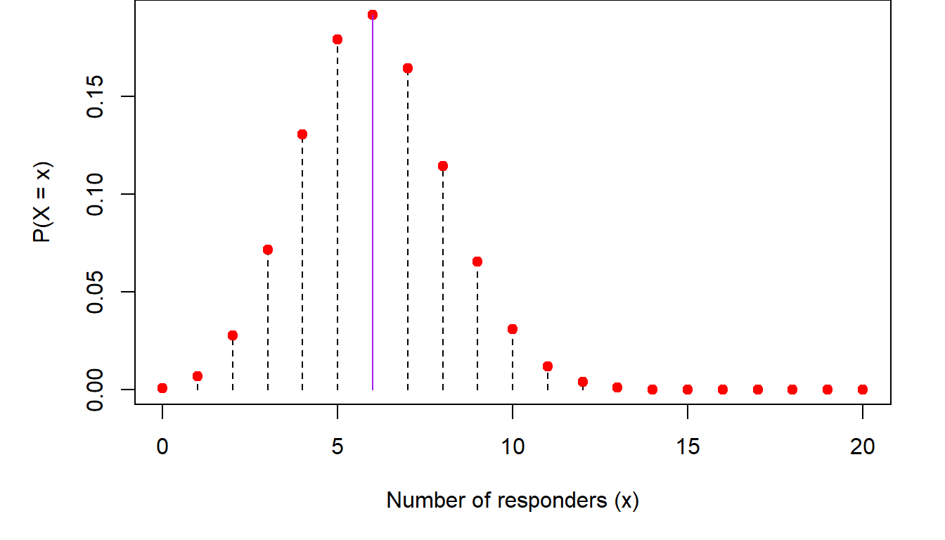
The most common ways that categorical data are analyzed is through the binomial distribution. Recall from (Chapter 3), the discussion about the binomial distribution. There we said that the probability that an outcome of interest occurs \(X=x\) out of \(n\) times is \[ P(X=x)=\left (\begin{array}{c} n\\x\end{array}\right )p^x(1-p)^{n-x} \] where \(p\) is the probability of observing a single such event. An example of this is modeling response to a medication. If \(n=20\) people take this medication, the probability of observing \(X=8\) with favorable response is, assuming the probability of each person responding is \(p=30\%\) \[ P(X=8)=\left (\begin{array}{c} 20\\8\end{array}\right )0.3^8(1-0.3)^{20-8}=0.114 \] In other words, if we carry out a large number of similar clinical studies, we would expect to see 8/20 responders in only 11.4% of them. The reason is that, if the underlying response rate is \(p=0.3\) we would expect to see, on average, \(np=20\times 0.3=6\) responders. So, to see two more responders than expected on average has lower probability. Similarly, the probability that we would see \(x=10\) responders is \(P(X=10)=0.031\), which is even lower than seeing \(x=8\) responders. The same is true for the case where the number of responders is below the mean. For example, the probability of seeing \(x=2\) responders is \(P(X=2)=0.028\). Plotting these probabilities we get the following trends:
So, as we get away from the mean (shown in purple in the figure) in either direction, the probability of observing either too large or too small a number of responders decreases.
Estimating \(p\)
In many cases we do not know what \(p\) is. For example, when we evaluate the response to a new drug, we do not know what the probability of a favorable response will be for someone taking the experimental medication. All we will be able to observe is the number of people with some given characteristic (e.g., a cancer diagnosis) who took the medication and the number among them that experienced a favorable response. In this case, we need to turn the problem on its head. Instead of asking what is the probability of seeing \(x\) responders out of \(n\) patients, if the response rate is \(p\), we ask what is the probability that \(p\) is such and such, given that I have observed \(x\) responders out of \(n\) people who received the drug.
As we saw above, the probability of seeing a number of responders that is much higher or much lower than the average response \(np\) is low. Conversely the probability that the population response is much higher or lower than the observed response in our study, i.e., \(\hat p=\frac{x}{n}=\frac{8}{20}=0.40\), will also be low. We can get an idea of these probabilities by performing a simulation. We will repeatedly generate virtual clinical trials like ours, with \(n=20\) patients receiving a drug with and \(x=8\) of them responding. In each of these simulations, I will consider response rates between 5% and 95% in increments of 5%. The proportion of time that \(x=8\) responders were observed in the simulated trials when the population response rate is \(p=5\%, 10\%, 20\%, \cdots\) will be the empirical probability distribution of \(p\). Here is this distribution:
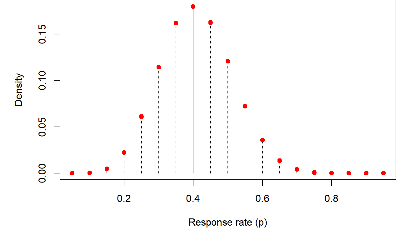
In the previous figure, we list the empirical (i.e., observed through simulation) distribution of \(p\), the population response inferred from \(x=8\) responders out of \(n=20\) study participants. The highest probability generated from these simulations corresponds to the observed proportion of responders \(\hat p=0.40\). Empirical probabilities diminish as one moves farther from \(\hat p\) in either direction.
The normal approximation to the binomial distribution
A simple (and, back when computers weren’t as powerful as they are today, necessary) approximation method of estimating \(p\) is through the Central Limit Theorem. Without going too far into the weeds of the theory, the end result is that the quantity \[ Z=\frac{\hat p-p}{\sqrt{p(1-p)/n}}\sim N(0,1) \] In other words, if we subtract from the observed response rate its (unknown) mean and divide it by its standard deviation, the resulting quantity will be distributed according to the normal distribution. Since \(p\) is unknown, \(Z\) can only be calculated if we make some assumption about the value of \(p\), the unknown population proportion. In the following figure, we consider several values for \(p\) ranging from \(p=0.05,\cdots, 0.95\), so we can see what the distribution of \(p\) based on the normal approximation to the binomial might look like. We also plot the distribution resulting from the previous simulation for comparison.
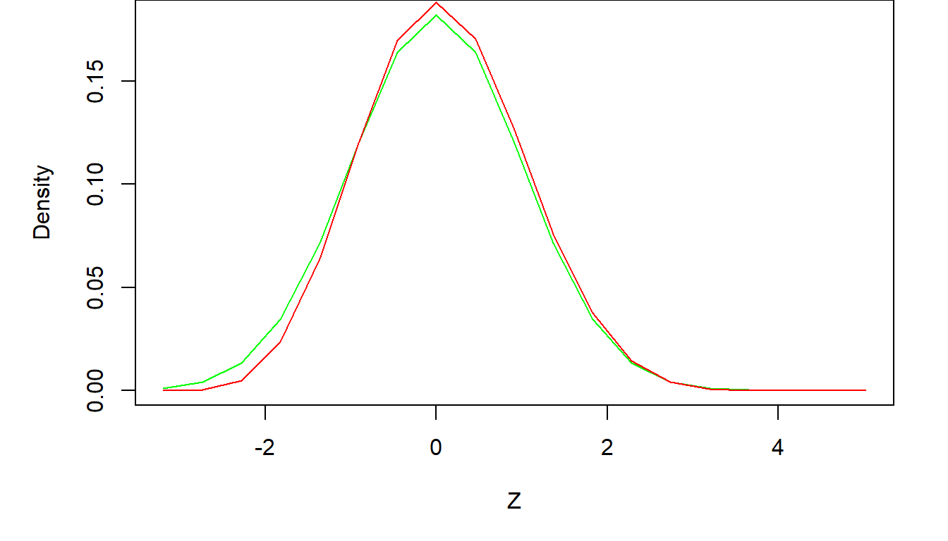
The agreement between the exact and approximate results is very good. In general, if \(p\) is not too small or too large, and \(n\) the number of individuals under study is not too small, the normal approximation will be sufficient. A rule of thumb addressing both of these requirements is that the mean of the binomial distribution \(np>5\) and that \(n(1-p)>5\). Thus, if \(p\) is close to zero or one, the sample size must be higher to counteract the loss of precision in the normal approximation, but smaller sample sizes can be considered for values of \(p\) away from the edges of the zero-one continuum.
Confidence intervals for \(p\)
One very important use of the normal approximation is the construction of approximate confidence intervals for \(p\), something that is difficult to calculate exactly. As we saw previously in [put chapter reference here], a 95% two-sided confidence interval based on the normal distribution is bounded by \(\pm 2\) standard deviations on either side of the mean. This is the case here as well, where the mean is the population mean and the standard deviation is \(\sigma=\sqrt{p(1-p)/n}\). So, an approximate 95% confidence interval for \(p\) is \[ \left (\hat p-1.96\times \sqrt{p(1-p)/n}), \hat p+1.96\times \sqrt{p(1-p)/n)}\right ) \] where \(\hat p=\frac{x}{n}\) is the observed proportion. As \(p\) in the population is not known, the standard deviation is estimated by plugging in \(\hat p\) for \(p\) in the above equation. In the example above, \(\hat p=\frac{8}{20}=0.40\) and thus, the 95% confidence interval is \[\left ( 0.40-1.96\sqrt{(0.4)(0.6)/20}, 0.40+1.96\sqrt{(0.4)(0.6)/20} \right )\] \[ \Downarrow \] \[(0.185, 0.615)\] The interpretation of this confidence interval is that, based on our observed \(x=8\) responders out of \(n=20\) individuals studied, we are 95% confident that the unknown true response rate is between \(p_l=18.5\%\) and \(p_u=61.5\%\).
Tests of hypotheses involving \(p\)
We can use the ideas presented in the last section to perform hypothesis testing involving \(p\). In medical statistics, such tests take on the form of assessing whether the observed data are consistent with an a priori hypothesis of what the response rate might be. This is very useful in clinical research for example, because we can use these methods to ascertain whether the data generated by a study are consistent with the response rate of a new drug exceeding some baseline level \(p_0\). Construction of such tests follows our usual process of forming a working or “null” hypothesis where the response rate of a new drug \(p\) does not exceed \(p_0\) and hope our data produce evidence to the contrary (what we call the alternative hypothesis). For example, if the historical response rate with current medications is 20%, our working or null hypothesis is to assume that the response rate \(p\) of the experimental drug under study is no higher than baseline, i.e., \(H_0: p\leq p_0=0.20\). Then, using the data collected during the clinical trial, we can estimate \(p\), the response of the new drug, and see whether it is much higher than one would expect if the true response rate were \(p_0\).
As an example, let’s say that we undertake a clinical trial with \(n=20\) participants and observe \(x=8\) responses. One way to decide whether \(p\leq p_0\) can be based on the lower bound of a 95% one-sided confidence interval for \(p\) generated by the observed data. We will discuss how this interval is constructed in a second. To see why this is a viable approach, recall that confidence intervals contain all the plausible scenarios about the response rate (for the given confidence level of course). Thus, if the lower bound of these plausible values is higher than \(p_0\), then all values of \(p\) one can envision are higher than \(p_0\) as well. If our desired confidence level were, say, 95% and we observed this, we would be 95% “confident” that the response rate is \(p>p_0\). In that case we would conclude that the new drug improves upon the current baseline response rate.
To construct such a confidence interval we can use either the exact binomial distribution or the normal approximation. In the first case, the lower bound of the one-sided 95% confidence interval for \(p\), the response rate of the experimental drug, based on observed data of \(x=8\) responses out of \(n=20\) study participants,
An alternative way to go about this is by using the normal approximation to the binomial. We saw in [cite chapter here] that the lower bound of a one-sided 95% confidence interval, based on the normal distribution, is 1.645 standard deviations below the mean. If the mean in our case is estimated by \(\hat p=\frac{8}{20}=0.40\), and the standar deviation by \(s=\sqrt{\hat p(1-\hat p)/n}=0.11\), then the lower bound of the one-sided 95% confidence interval is \(p_l=0.22\). This very close to the exact bound shown above.
The conclusion from both types of confidence intervals is that the smallest value for the response rate of the experimental drug that anyone could envision with 95% confidence is around \(22\%-23\%\). This is higher than the baseline rate \(p_0=20\%\). In turn, this means that, based on the observed number of \(x=8\) responses in our study out of \(n=20\) participants, the unknown population response rate for the drug under study is higher than \(p_0=20\%\).
8.3 Comparing two proportions \(p_1\) and \(p_2\)
Comparing a proportion, like the rate of response to a medication, to a historical or external baseline rate is an efficient way to estimate it without involving large samples. However, the level of evidence obtained from such an analysis is not as high as comparing two populations head to head. In clinical research for example, data at the source of the baseline estimate of the response rate were not collected under circumstances which are identical to our current study, they were collected in different time periods, on different populations and so on. The more definitive approach is to compare two concurrently sampled populations, one taking the current standard therapy and one receiving the experimental therapy. The same is true when we assess the risk of disease based on some exposure. We can compare the observed frequency of the occurrence of the disease to a historical rate. However, more definitive conclusions can be obtained when we compare some exposure between two populations and compare the frequency of occurrence of some outcome between them (e.g., occurrence of melanoma to populations at different exposure levels to sunlight).
Estimating the difference \(p_1-p_2\)
The ability to estimate the difference of two proportions is important for a number of reasons. It provides an idea of whether \(p_1\) and \(p_2\) are equal. In clinical investigation, this addresses the question whether the response to a new drug is higher compared to the standard of care. In epidemiology, these proportions may reflect whether the risk of occurrence of some disease is different among individuals who were or were not exposed to some risk factor.
As the true proportions in the populations under study are not known, we will need to estimate them from sampled data. The usual strategy can be applied, where we sample \(n_1\) people in the first group (people receiving a specific medication or being exposed to some factor) and \(n_2\) in the second group and count the number of times \(x_1\) and \(x_2\), that the characteristic of interest (response to a medication or presence of disease) has occurred in each group respectively. From these two samples we can obtain our best (“point”) estimates for \(p_1\) and \(p_2\) as \(\hat p_1=\frac{x_1}{n_1}\) and \(\hat p_2=\frac{x_2}{n_2}\). Consequently, our best estimate for the difference \(p_1-p_2\) will be \(\hat p_1-\hat p_2\). None of this is too complicated. Where matters start getting interesting is when we want to estimate the distribution of the difference of the two proportions. Deriving a distribution is a crucial task because it gives us an idea of what differences are more likely to occur and which are less likely. In its more immediate use, obtaining this distribution allows us to construct confidence intervals for the difference in the two proportions. It can also help us construct a criterion based on which we will decide whether the two proportions are equal or not.
The normal approximation to the distribution of \(\hat p_1-\hat p_2\)
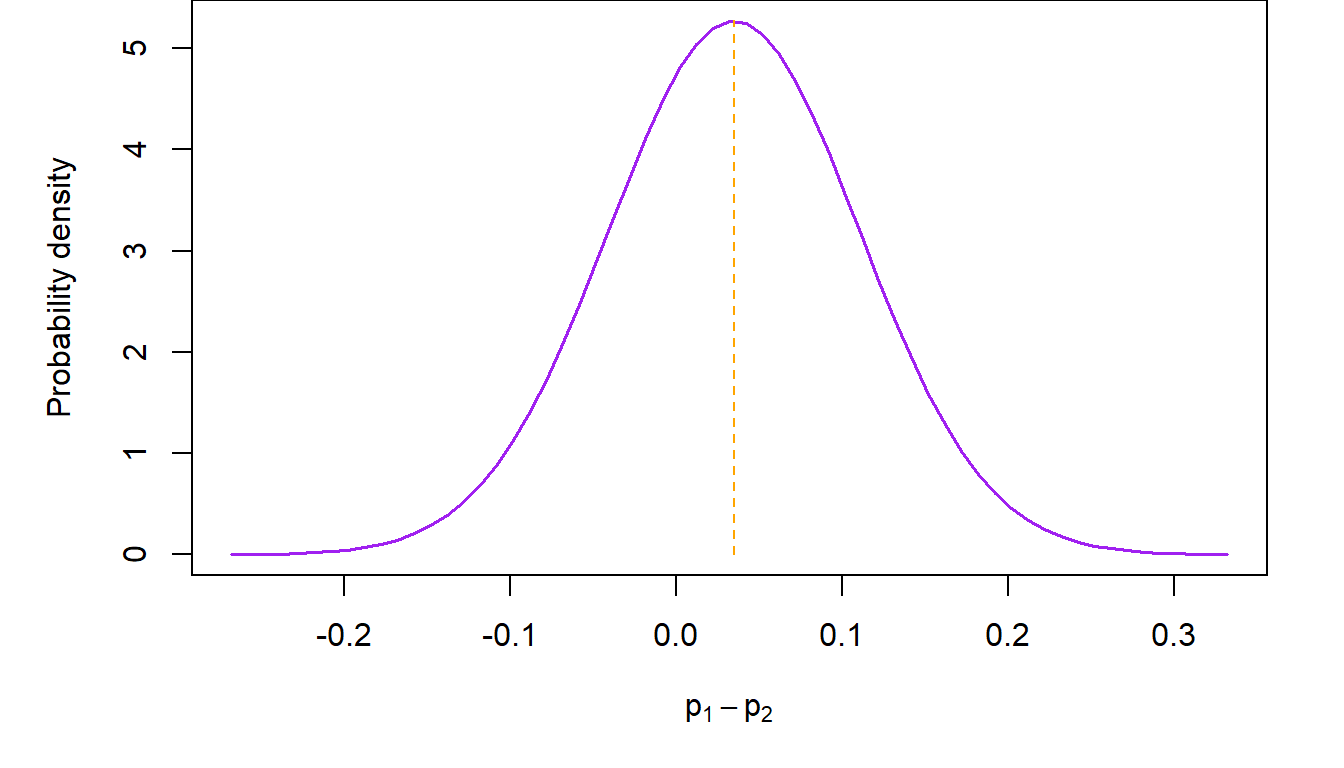
The simplest way to estimate the distribution of the difference of two proportions is by using the normal approximation to the binomial distribution. Statistical theory, which we will not go into here, prescribes that, assuming that \(n_1\) and \(n_2\) are not too small and \(p_1\) and \(p_2\) too small or two large, the distribution of \(\hat p_1-\hat p_2\) is close to a normal distribution with mean \(p_1-p_2\) and standard deviation \(\sqrt{\frac{p_1(1-p_1)}{n_1}+\frac{p_2(1-p_2)}{n_2}}\).
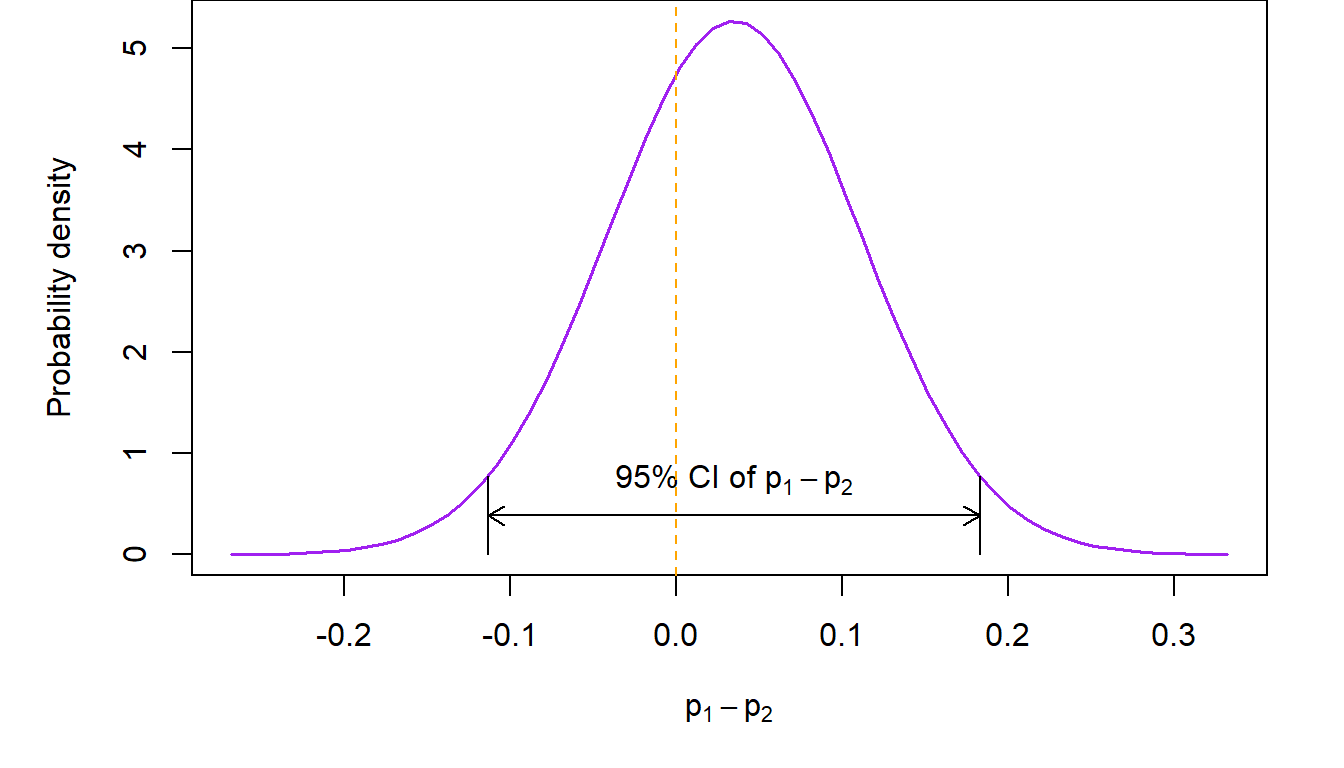
For example, consider the trial of belotecan versus topotecan in recurrent ovarian cancer (Kim et al., Br J Cancer, 2021). In that study, \(n_1=71\) women diagnosed with recurrent ovarian cancer received belotecan 0.5 mg/m2 and \(n_2=69\) topotecan 1.5 mg/m2 for five consecutive days every 3 weeks. The study based its conclusion on the difference in overall response rate between the two treatment groups. At the completion of the study, \(x_1=21\) subjects in the belotecan arm had a partial or complete response (so \(\hat p_1=29.6\%\)), compared to \(x_2=18\) in the topotecan arm (\(\hat p_1=26.1\%\)). The normal approximation to the distribution of the difference is shown in the next figure.
Confidence intervals for \(p_1-p_2\)
Confidence intervals for the difference of two proportions can be calculated as usual by appealing to properties of the normal distribution. For example, a 95% two-sided confidence interval in the previous example will be \[ \small \left ( \hat p_1-\hat p_2-1.96\times \sqrt{\frac{p_1(1-p_1)}{n_1}+\frac{p_2(1-p_2)}{n-2}}, \hat p_1-\hat p_2+1.96\times \sqrt{\frac{p_1(1-p_1)}{n_1}+\frac{p_2(1-p_2)}{n-2}}\right ) \] In the above, \(p_1\) and \(p_2\) are not known, so we substitute \(\hat p_1\) and \(\hat p_2\) for them respectively in order to calculate the confidence interval. Theory tells us that this will work if \(n_1\) and \(n_2\) are not too small. In the ovarian cancer study example, the 95% two-sided confidence interval of the difference in overall response rates between belotecan and topotecan is \[ (-0.113, 0.183) \] The interpretation of the above confidence interval is that we expect that 95% of the time, the unknown difference in the two response rates will be between \(11.3\%\) in favor of topotecan (implying that the topotecan response rate is larger than belotecan’s) and \(18.3\%\) in favor of belotecan (implying that the response rate of belotecan is larger than topotecan’s).
Testing hypotheses involving \(p_1\) and \(p_2\)
Following our usual strategy for performing tests of statistical hypotheses, our working or null hypothesis is that there is no difference between the response rates corresponding to the two groups, i.e., \(H_0: p_1=p_2\) or, equivalently, \(H_0:p_1-p_2=0\). An immediate way to decide whether the null hypothesis is true is through the confidence interval of \(p_1-p_2\) constructed in the previous section. Recall that confidence intervals include all the plausible values which are anticipated based on some pre-specified confidence level. So, one way to check whether the null hypothesis is correct, is by looking to see whether the value of the difference under the null hypothesis is contained within the confidence interval. If the answer is “yes”, then the evidence from the data is consistent with the null hypothesis, so we do not reject \(H_0\). Conversely, if this value is not included in the confidence interval, then it is not among the plausible values implied by our working hypothesis, so we reject it. Here note that the difference between \(p_1\) and \(p_2\) does not have to be zero under \(H_0\). In a number of situations (most notable among them are non-inferiority study designs), the difference may be some nonzero number. All of the methods discussed here can also be applied in those cases as well.
Working through this logic in the previous example, we see that \(p_1-p_2=0\) is included in the 95% two-sided confidence interval, since its bounds straddle zero. This is evidence consistent with the hypothesis that there is no difference in the overall response rate between the two drugs. A pictorial representation of what we just said follows.
We can also carry out this test based on a single p value associated with the following statistic \[ Z=\frac{\hat p_1-\hat p_2}{\sqrt{\hat p(1-\hat p) \left ( \frac{1}{n_1}+\frac{1}{n_2}\right )}}\sim N(0,1) \] where \(\hat p=\frac{x_1+x_2}{n_1+n_2}\) is a pooled estimate of the common response rate \(p\). Note that, if \(p_1=p_2\), as it is assumed under the null hypothesis, the observed response rates in the two groups are simply random manifestations of the true single population response rate. So our best estimate is to use the entire data set to estimate the common rate. We do so by obtaining the single response rate resulting from pooling the observed responses \(x_1+x_2\)and dividing this sum by the total sample size \(n_1+n_2\) in the two groups.
The p value is calculated as the probability of seeing the observed \(Z\) value or any other value that is more extreme (i.e., to the right of a \(Z\) and/or to the left of a negative \(Z\) value) if our working hypothesis is true. If this probability is low (i.e., below our a priori specified alpha level) then we reject the null hypothesis, as low p values suggest that the evidence provided by the observed data are not consistent with the working hypothesis. In this case, we reject \(H_0:p_1=p_2\) and conclude that \(p_1\neq p_2\). Conversely, if the p value is high, then the probability that we see a difference like the one observed in this study is high, so the evidence produced by the data is consistent with the null hypothesis. In this case we do not reject the null hypothesis. The “and/or” in the definition of the p value above comes into play when the null hypothesis is two-sided. In this case, both the areas under the curve to the right of \(|Z|\) and the left of \(-|Z|\) are summed up. In the ovarian cancer example, our null hypothesis is two-sided (i.e., it does not imply direction of the superiority or inferiority in the difference) so the p value is calculated as shown in the colored areas of the next figure.
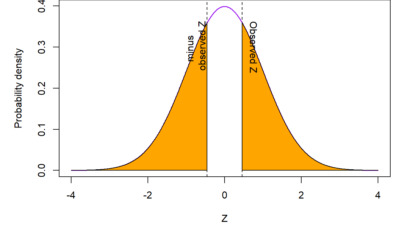
In the above figure, summing up the two shaded regions to the right of \(Z\) and to the left of \(-Z\) gives us a p value \(p=0.645\). Since the p value is not below \(\alpha=0.05\), the data are consistent with the working hypothesis of no difference between the response rates in the belotecan and topotecan arms. We conclude that there is no evidence that the overall response rates are different in the two drugs.
8.4 Contingency tables
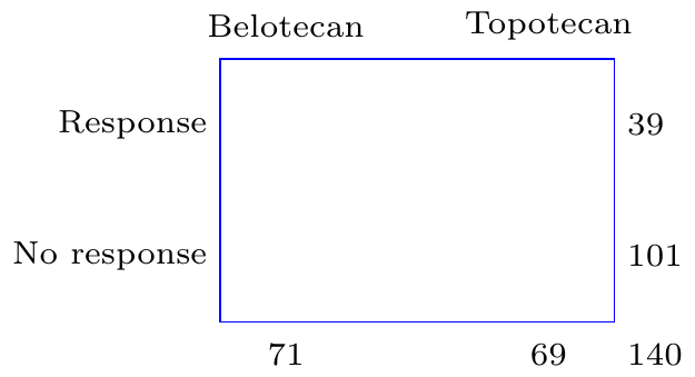
A very useful way of presenting data that express the frequency of the occurrence of some event, is through cross-tabulations. For example, response to treatment, among women participating in the ovarian cancer clinical trial described in the previous section, can be presented as a \(2\times 2\) cross-tabulation of those who received belotecan or topotecan versus those who experienced a partial or complete response of their tumors and those who did not.
Treatment group |
|||
|---|---|---|---|
Response |
Belotecan |
Topotecan |
Total |
Yes |
21 |
18 |
39 |
No |
50 |
51 |
101 |
Total |
71 |
69 |
140 |
Contingency tables are also used when we summarize data which are related to the occurrence of disease separated by whether an individual had been exposed to some risk factor or not. Here is an example of data from the Electricity Generating Authority of Thailand (EGAT) cohort (Vathesatogkit et al., Int J Epi, 2012). This study (also see Epidemiology: Study Design and Data Analysis, Third Edition by Mark Woodward, Chapman & Hall/CRC Texts in Statistical Science, 2014, page 91) followed a cohort of employees of the Electricity Generating Authority of Thailand. Study participants filled out a questionnaire at entry into the study where, among other information, they were asked about whether they smoked. Twelve years later, data on deaths from cardiovascular disease (CVD) were available on 3,315 individuals (over 95% of the original study cohort). Here is a summary of these data.
Smoker? |
|||
|---|---|---|---|
Death from CVD? |
Yes |
No |
Total |
Yes |
31 |
15 |
46 |
No |
1,386 |
1,883 |
3,269 |
Total |
1,417 |
1,898 |
3,315 |
In both of the above examples, the scientific question is about whether exposure to a certain medication (belotecan or topotecan in the ovarian cancer trial) or a risk factor (smoking in the EGAT cohort study) is associated with the probability that a person will experience a certain event. In the case of the clinical trial, the event of interest is overall response to treatment. In the EGAT observational cohort study it is the risk of dying with evidence of cardiovascular disease. While the interpretation of the two outcomes is different (probability of response to treatment versus risk of disease occurrence), conclusions on the potential association of exposure with the outcome is based on the proportion of individuals who experienced the event of interest (response or death from CVD) out of all persons under study. Consequently, the same methods can be applied to address both of these questions.
The chi-square test of association
Let’s go back to the ovarian cancer study. The investigators were keen on finding out whether response rates to belotecan were different from those of topotecan. We discussed previously how this question might be answered by comparing the response rates in the two treatment arms. Another way, which will turn out to produce equivalent results, is to address whether taking a specific medication is associated to the overall rate of response. Seen from the perspective of an individual patient, this is the probability that they respond to medication. How might this associational question be answered? Well let’s see what are the implications of a working hypothesis of no association. Consider the table from the ovarian cancer data, with the internal counts removed:
As we discussed earlier, in the absence of any association between drug exposure and response, the best estimate of the probability of response is \(\hat p=\frac{x_1+x_2}{n_1+n_2}=\frac{21+18}{71+69}=0.279\). Given properties of proportions described in chapter [cite chapter here], when discussing the binomial distribution, we would expect that, on average, \(n_1\hat p=19.8\) individuals will respond in the belotecan arm and \(n_2\hat p=19.2\) subjects will respond in the topotecan arm. Conversely, \(n_1(1-\hat p)=51.2\) and \(n_2(1-\hat p)=49.8\) study participants will be expected to not respond in the two arms respectively. Consequently, under the assumption of no association between treatment and response, Table 1 above should have looked like this:
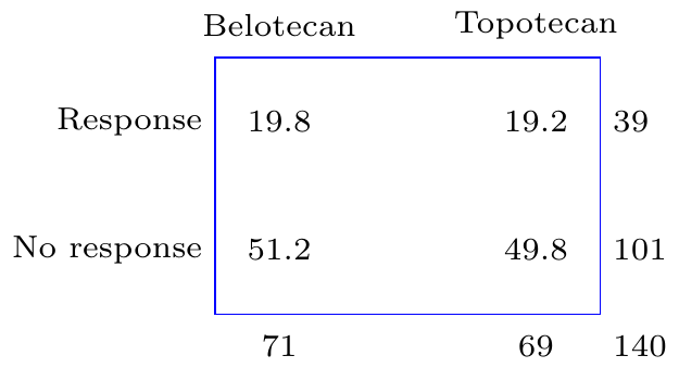
So slightly less people would be expected to have responded in the belotecan arm, 19.8 versus 21, and slightly more people would be expected to have responded in the topotecan arm, 19.2 versus 18, if there were no association between which treatment was taken and response to the drug. In addition, slightly more people, 51.2 versus 50 would be expected not to respond in the belotecan arm and slightly less, 49.8 versus 51, in the topotecan arm.
The question which will help us reach a conclusion is whether the observed average counts are too different from what would be expected, if there were no association between treatment and response, beyond what would be attributable to chance alone. To test this formally, we use a statistic which aggregates the squared differences between the counts that would be expected and those that are actually observed as proportions of the expected counts. This is, \[ X=\sum_{i=1}^{r\times c}\frac{(O_i-E_i)^2}{E_i} \] where \(O_i\) and \(E_i\) are, respectively, the observed and expected counts in each of the \(r\times c\) interior cells of the contingency table. In our example, the number of rows and columns in the table, \(r=2\) and \(c=2\), but this is not always the case. This methodology will work for other combinations of \(r\) and \(c\) as well. Taking the squared differences underlines our lack of preference about whether the deviation from what is expected from the null hypothesis is in one direction or the other, so squared differences are useful as they correspond to our understanding of the problem.
However, most importantly, the sum of the squared differences between observed counts and expected counts, has a known distribution. The distribution of the statistic, generated by aggregating the square differences of observed and expected counts is the chi-square distribution, indexed by degrees of freedom which are equal to \((c-1)\times (r-1)\). Having a known distribution is important, because we can quantify how likely it is to observe the test statistic that is generated by adding together these square counts if there is no association between the two factors in the table (here treatment and response). If the observed statistic is unlikely to have occurred, we will reject the null hypothesis in favor of the alternative that there is a significant association between the factors under consideration. We can also generate p values using this statistic. These correspond to the area under the chi-square curve to the right of the observed statistic.
Let’s implement the chi-square test in the ovarian cancer example. The chi-square statistic is \[X=\frac{(21 -19.8)^2}{19.8}+ \frac{(18-19.2)^2}{19.2} + \frac{(50-51.2)^2}{51.2} + \frac{(51 -49.8)^2}{49.8}= 0.212\] The p value associated with this test statistic, compared to a chi-square distribution with \(1=(2-1)\times (2-1)\) degrees of freedom, is \(p=0.645\). The pictorial representation of this test is shown in the following figure.
The conclusion from this analysis is that there does not appear to be sufficient evidence in these data supporting an association between taking belotecan or topotecan and responding to the medication or not.
These results are consistent with our earlier conclusion that there is no difference between the response rates in the two treatment arms. As it turns out, the two tests are equivalent! Recall that our test statistic in the comparison of \(p_1\) versus \(p_2\), the response rates in the ovarian cancer study, was \(Z=0.461\). This is equal to \(\sqrt{X}=\sqrt{0.212}=0.461\)). That is, the \(Z\) statistic in the test of the difference between two proportions is equal to the square root of the chi-square statistic from the \(2\times 2\) table testing the association between two factors. So, in the special case of \(2\times 2\) contingency tables, the \(Z\) test of difference between \(p_1\) and \(p_2\) and the chi-square test of the association of two factors are equivalent as they address the same question from two different perspectives. This relationship is not generally true for chi-square tests involving arbitrary \(r\times c\) contingency tables.
8.5 Exposure and disease: the concept of risk
In epidemiology, a major concept that people study is that of risk. Risk is the probability that one would observe some (usually adverse) event. We talk about the risk of heart disease, or the risk of cancer for example. Risk can also be the probability of experiencing a positive event such as disease remission or response to a medication. This latter interpretation applies to the idea of risk as a proportion or probability rather than the negative meaning of the everyday use of the word.
In the EGAT cohort study, the investigators assessed the risk of cardiovascular disease (CVD). In the \(2\times 2\) table summarizing the frequency of CVD-related deaths and smoking status, the risk of CVD among the smokers is defined as the frequency of persons dying with evidence of CVD out of all smokers. Similarly, the risk of CVD among the non-smokers is the proportion of CVD-related deaths among people who were not smoking at the start of the study. This means that the risk of CVD among smokers is \(r_1=0.0219\) and the same among non-smokers is \(r_2=0.0079\). The pictorial representation of this is as follows:
At first glance, it appears that the risk of CVD among smokers is almost three-fold higher compared to non-smokers. However, is an absolute difference of 1.4% sufficient for us to conclude that smoking is associated with a higher CVD risk?
To understand whether smoking predisposes someone to a higher risk for CVD death, researchers may compare the risk between smokers and non-smokers (the exposure factor). Of course we can address this question by testing for a possible association between smoking and CVD. The chi-square test for this association is as follows:
Test statistic |
Obs. value |
DF |
P value |
N |
|
|---|---|---|---|---|---|
χ² |
11.57784 |
1 |
0.0006674236 |
N |
3,315 |
We see here that the observed chi-square statistic in the EGAT study is \(X=11.6\) with an associated p value \(p=0.000667<0.05=\alpha\). So we conclude that the evidence from the data is not consistent with the null hypothesis of no association between smoking and CVD. There appears to be strong evidence of an association between smoking death from cardiovascular disease.
Comparison of risks: the risk ratio
The previous analysis is addressing the question of association but does not provide direct information about the actual levels of risk and, more importantly, the difference in risk between the two exposure groups (i.e., smokers and non-smokers). We addressed this question with chi-square test of association in the previous chapter. This, as we discussed earlier, is equivalent with the test of the difference between two proportions. So the chi-square test addresses the question of whether the levels of CVD risks are the same among smokers and non-smokers. Another way to address the same question is to estimate the risk ratio. This is the ratio of the risk in the exposed group (smokers here) over the risk in the unexposed group (non-smokers). In the EGAT study, the risk ratio is \[ RR=\frac{\frac{31}{1417}}{\frac{15}{1898}}=2.77\]
In other words, the relative risk of CVD is almost three-fold higher compared to non-smokers. To see whether this apparent enormous increase in risk is statistically significant (i.e., it is larger than what would be expected by chance), we have to test this formally. To do so, we need to recast the null hypothesis that CVD risk is not different between smokers and non-smokers in terms of a ratio of the two risks. So the null hypothesis \(H_0:r_1=r_2 \equiv r_1-r_2=0\), for the risk of CVD among smokers and non-smokers respectively, is expressed as \(H_0: RR=\frac{r_1}{r_2}=1\). Here, \(RR\) is the relative risk or the CVD risk ratio between the two exposure groups.
We will reach a conclusion about whether the observed relative risk \(RR=2.77>1\), more than what would be expected by chance, by constructing a 95% confidence interval. If this confidence interval does not contain \(RR=1\), then we will reject \(H_0\) in favor of the alternative \(RR\neq 1\). Let’s consult the relevant output in the \(2\times 2\) contingency table above (see Table 2). The output generating the point estimate and 95% confidence interval of the relative risk of CVD between smokers and non-smokers in the EGAT study is as follows:
95% confidence interval |
|||
|---|---|---|---|
Point estimate |
Lower bound |
Upper bound |
|
Relative risk |
2.768196 |
1.500194 |
5.107944 |
Since the 95% confidence interval \((1.5, 5.11)\) does not include the value \(RR=1\), which is explicitly anticipated by the null hypothesis of no difference in CVD risk, we reject \(H_0:RR=1\). The conclusion is that the risk of CVD is different between smokers and non-smokers. A straightforward inspection of the point estimate \(RR=2.77\), suggests that the risk of CVD is significantly elevated among smokers compared to non-smokers.
8.6 The odds and odds ratio
Another way to go about understanding differences in risk is using the odds ratio. Before we get to that, let’s define the concept of odds. Odds is the ratio between the proportion of those who experienced an event over the proportion of those who did not among the exposed and similarly among the unexposed. In the EGAT study (Table 2), the odds of CVD among smokers is \[odds_1=\frac{\frac{31}{1417}}{\frac{1386}{1417}}=\frac{31}{1386}=0.0224\]
Similarly, the odds of CVD among non-smokers is \[odds_2=\frac{\frac{15}{1898}}{\frac{1883}{1898}}=\frac{15}{1883}=0.00797\]
Similarly to the concept of a relative risk, we have the idea of an odds ratio. This is the ratio of the odds among exposed and unexposed individuals, i.e.,
\[OR=\frac{odds_1}{odds_2}=\frac{31\times 1883}{15\times 1386}=2.81\]
Going back to Table 2 we see that we can estimate the odds ratio as the ratio of the product of the counts in the main diagonal of the table (cells [1,2] and [2,3]) divided by the product of the counts on the secondary diagonal (cells [1,3] and [2,2]).
Case-control studies
From these calculations we understand that the odds is not a measure of risk. It’s simply a measure of the increase or decrease of the proportion of some characteristic of interest (e.g., a disease, response to therapy, etc.) between two groups. So, it would not be unreasonable to ask why we need the odds ratio at all, given that we have the relative risk to work with. So what’s the attraction here? Why has the odds ratio, as a measure of the relative risk persisted over time and is used widely to this day? There are three reasons for the persistence of the odds ratio as a measure of risk: case-control studies; case-control studies; case-control studies!
Let’s recall the EGAT study. This study, despite having recruited almost 3,500 people and followed them for twelve years, based its conclusions about whether smoking is associated with increased risk of death from cardiovascular disease on a mere 46 CVD-related deaths! As a result, the lower bound of the 95% confidence interval of the relative risk was barely above 1. The conclusion that smoking is associated with an increased risk of CVD death was statistically significant only because of the dramatic increase in the risk associated with smoking. Any lower value of the risk ratio would have resulted in an unclear result. The same is true in most such studies. The design involves the selection of two or more cohorts of study participants who have some exposure (e.g., receive some medication to prevent the occurrence of an event or are exposed to some risk factor). As in the EGAT study, we then enroll these subjects in the study and then … we wait; and wait; and wait for the event of interest to occur in a sufficient number of study participants so that we can compare the two groups and extract a conclusion about whether taking a medication or being exposed to some risk factor alters the likelihood of experiencing the event of interest.
Alternatively, we can go on some hospital database and select the number of events we are interested in (“cases”) and then select in some manner individuals who did not experience the event of interest (“controls”) who are otherwise as similar to the cases as possible. For example, consider the following study (Newton-Bishop et al., Eur J Cancer 2011), which explores the possible association of sun exposure with melanoma. There, 960 cases (people who had melanoma) were identified in Yorkshire and the Nothern Region of the river Tyne in the UK) and were matched to 513 individuals from the surrounding population who did not have melanoma. The \(2\times 2\) table summarizing previous sun exposure (expressed as having experienced at least one sunburn after the age of 20) was available on 1,335 of the 1,473 individuals who participated in the study and is shown below (bottom of Table 2 in paper describing the melanoma study):
Sun burn after 20? |
|||
|---|---|---|---|
Melanoma? |
Yes |
No |
Total |
Yes |
297 |
561 |
858 |
No |
130 |
347 |
477 |
Total |
427 |
908 |
1,335 |
From this table, we can calculate the relative risk as \(RR=1.13\) with an associated 95% confidence interval \((1.04, 1.22)\) and go on to conclude that there is some weak evidence of a statistically significant elevation of melanoma risk among those who had experienced a sunburn after their 20th year. But something is wrong.
If these data are to be believed, there is a devastating epidemic of melanoma in Yorkshire! After all, (858/1335) x 100= \(64.3\%\) of the study population had experienced melanoma. Is it sun spots? Is it the famous English fair complexion in combination with summer vacations in sunnier environs? What is going on? What is happening is that we are in effect analyzing a retrospective study as if it were a prospective study. A retrospective study is one where the event has already occurred, and we look back for the reasons. A prospective study by contrast is one where we don’t know whether the event has happened at the start of the study and we look forward in time to see if it occurs. In the melanoma study, researchers identified almost 900 melanoma cases, but these cases did not occur among the \(1335\) subjects participating in the study. The denominator of these melanoma cases could be hundreds of thousands or even millions of people. There were 14.9 million people living in Northern England as of the 2011 census, the same period when this study took place. Consequently, the estimation of the relative risk is not accurate. By contrast, the odds ratio is \(OR=1.41\). This number is calculated as a function of proportions within the cases and the controls. So it is valid, despite the retrospective nature of the study design (because we don’t need to know the size of the population that our cases and controls came from as these numbers cancel in the calculation of the odds ratio). And this is why the odds ratio is so popular: it does not care whether the study is prospective or retrospective.
However, can the odds ratio be interpreted as a relative risk? To answer that, let’s return to the EGAT study. This is a prospectively designed study from the perspective that we did not know at the start who would die from CVD. In that study, the relative risk was \(RR=2.77\). The odds ratio was \(OR=2.81\), which is very close to the relative risk. How come? This is the case because death from CVD is a fairly rare event. So the odds ratio \[ OR=\frac{\frac{31}{1417}\times \frac{1883}{1898}} {\frac{1386}{1417}\times \frac{15}{1898}} \approx \frac{\frac{31}{1417}} {\frac{15}{1898}}= 2.77=RR\] The above approximation is possible because the proportions of those who did not experience CVD are almost 100% (i.e., \(\frac{1883}{1898}\approx 1\) and \(\frac{1386}{1417} \approx 1\)). So, for rare events, \(OR \approx RR\) and the odds ratio can be interpreted as a relative risk!
Given that melanoma is fairly rare cancer, the odds ratio in the melanoma study will be close to the true relative risk in the population; a lot closer than the relative risk produced by the case-control study. So our point estimate of the odds ratio \(OR=1.41\), suggests that the elevation of melanoma risk associated with sun exposure is \(41.3\%\) and not \(12.6\%\) as would be suggested by the relative risk estimate.