9 Correlation
When we have finished this chapter, we should be able to:
9.1 What is correlation?
Correlation is a statistical method used to assess a possible association between two numeric variables. There are several statistics that we can use to quantify correlation depending on the underlying relation of the data. In this chapter, we’ll learn about two correlation coefficients:
Pearson’s \(r\)
Spearman’s \(r_{s}\)
Pearson’s coefficient measures linear correlation, while the Spearman’s coefficient compare the ranks of data and measures monotonic associations.
9.2 Linear correlation (Pearson’s \(r\) coefficient)
Graphical display with a scatter plot
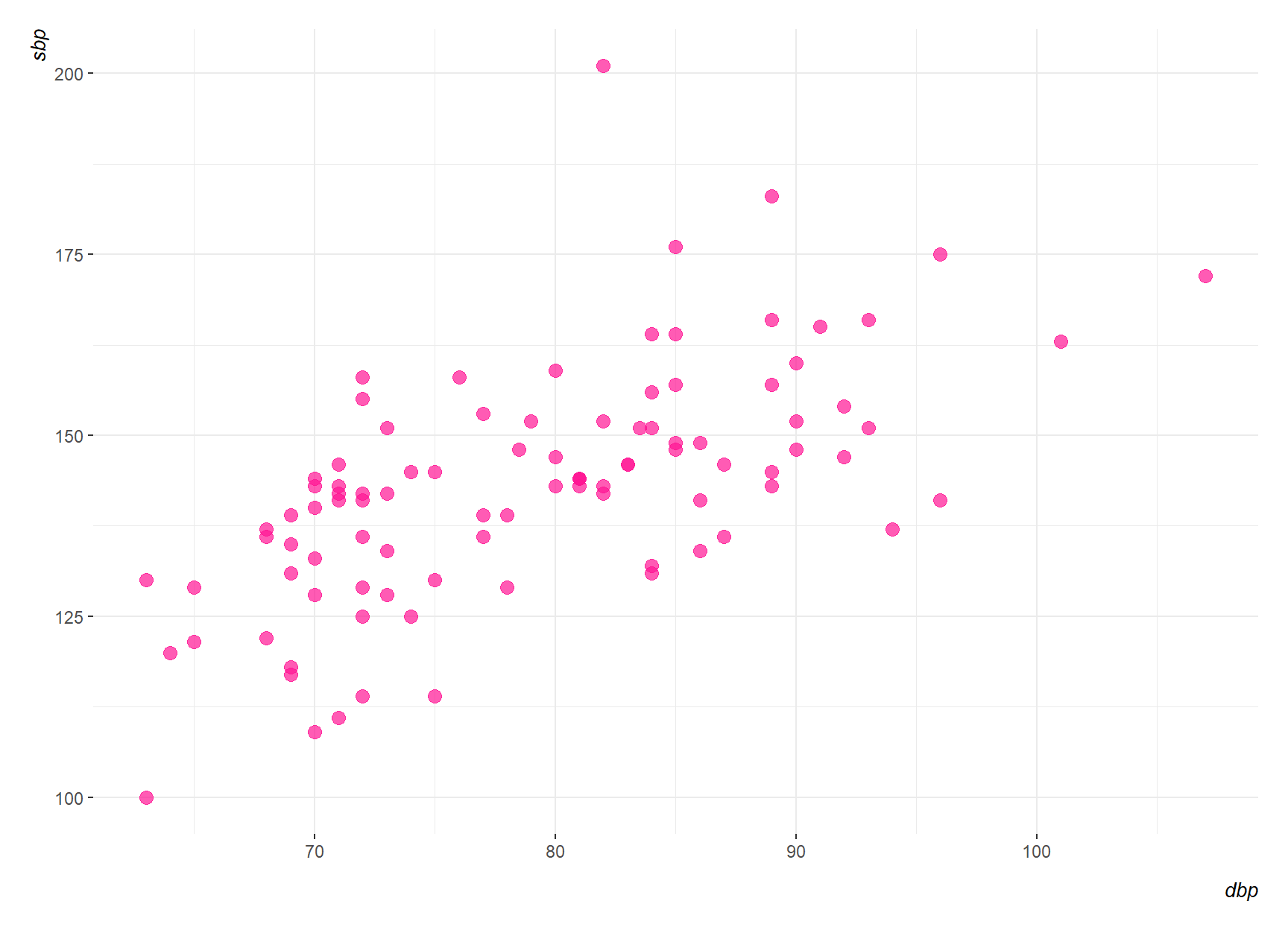
The most useful graph for displaying the association between two numeric variables is a scatter plot. Figure 9.1 shows the association between systolic blood pressure (sbp) and diastolic blood pressure (dpb) in 96 patients with carotid artery disease, aged 42-89, prior to surgery. (Note that sbp and dpb can be plotted on either axis).
From the scatter plot, there appears to be a linear association between sbp and dbp, with higher values of dbp being associated with higher values of sbp. How can we summarize this association simply? We could calculate the Pearson’s correlation coefficient, \(r\), which is a measure of the linear association between two numeric variables. The Pearson’s correlation coefficient is based on the sum of products about the mean of the two variables, so we shall start by considering the properties of the sum of products.
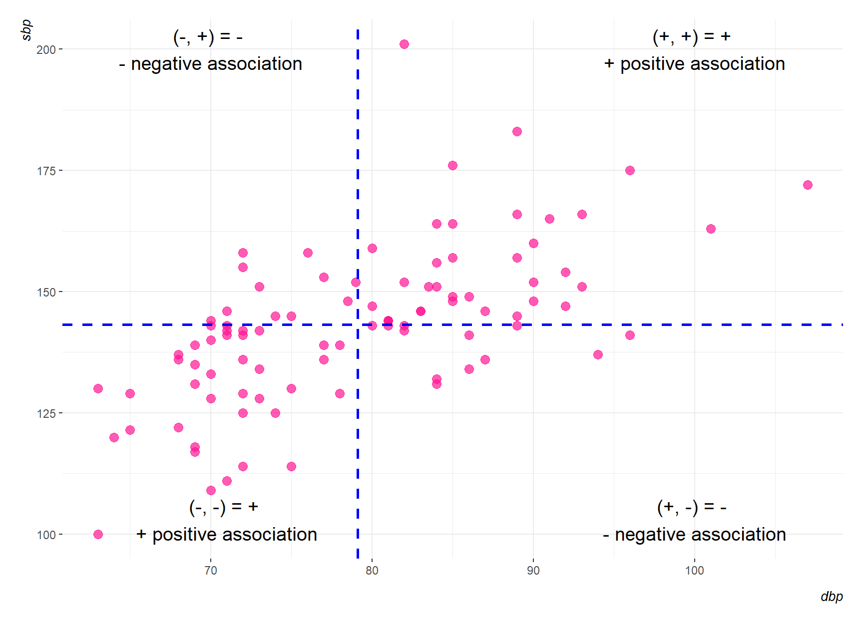
Figure 9.2 shows the scatter diagram of Figure 9.1 with two blue new axes drawn through the mean point. The distances of the points from these axes represent the deviations from the mean.
Positive product: In the top right section of Figure 9.2, the deviations from the mean of both variables, dbp and sbp, are positive. Hence, their products will be positive. In the bottom left section, the deviations from the mean of the two variables will both be negative. Again, their product will be positive.
Negative product: In the top left section of Figure 9.2, the deviation of dbp from its mean will be negative, and the deviation of sbp from its mean will be positive. The product of these will be negative. In the bottom right section, the product will again be negative.
So in Figure 9.2 most of these products will be positive, and their sum will be positive. We say that there is a positive correlation between the two variables; as one increases so does the other. If one variable decreased as the other increased, we would have a scatter diagram where most of the points lay in the top left and bottom right sections. In this case the sum of the products would be negative and there would be a negative correlation between the variables. When the two variables are not related, we have a scatter diagram with roughly the same number of points in each of the sections. In this case, there are as many positive as negative products, and the sum is zero. There is zero correlation or no correlation. The variables are said to be uncorrelated.
Pearson’s \({r}\) correlation coefficient
The Pearson’s correlation coefficient, \({r}\), can be calculated for any dataset with two numeric variables. However, before we calculate the Pearson’s \({r}\) coefficient we should make sure that the following assumptions are met:
Characteristics of Pearson’s correlation coefficient \(r\)
Formula
Given a set of \({n}\) pairs of observations \((x_{1},y_{1}),\ldots ,(x_{n},y_{n})\) with means \(\bar{x}\) and \(\bar{y}\) respectively, \(r\) is defined as:
\[r = \frac{\sum_{i=1}^n (x_i - \bar{x})(y_i - \bar{y})}{\sqrt{\sum_{i=1}^n (x_i - \bar{x})^2 \sum_{i=1}^n(y_i - \bar{y})^2}} \tag{9.1}\]
The \(r\) statistic shows the direction and measures the strength of the linear association between the variables.
Range of values
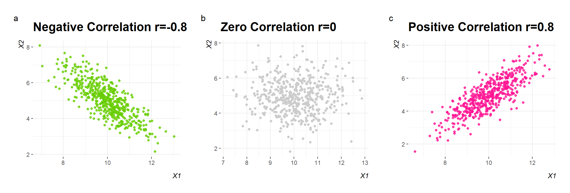
Correlation coefficient is a dimensionless quantity that takes a value in the range -1 to +1.
Direction of the association
A negative correlation coefficient indicates that one variable decreases in value as the other variable increases (and vice versa), a zero value indicates that no association exists between the two variables, and a positive coefficient indicates that both variables increase (or decrease) in value together.
Magnitude of the association
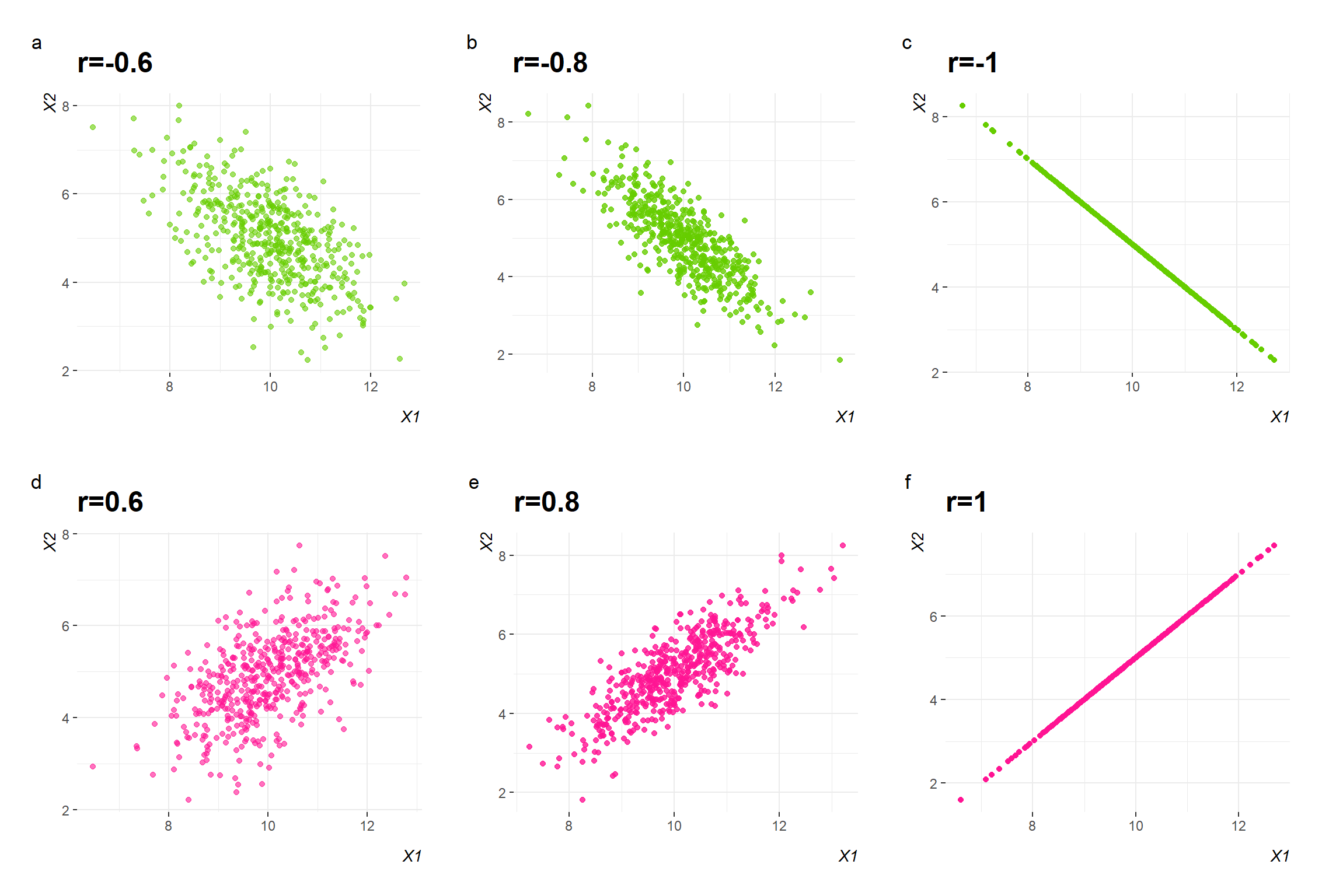
The magnitude of association can be anywhere between -1 and +1. The stronger the correlation, the closer the correlation coefficient comes to ±1 (Figure 9.4). A correlation coefficient of -1 or +1 indicates a perfect negative or positive association, respectively (Figure 9.4 c and f).
Interpretation of the association
The ?tbl-correlation demonstrates how to interpret the strength of an association.
| Value of r | Strength of association |
|---|---|
| \(|r| \geq{0.8}\) | very strong association |
| \(0.6\leq|r| < 0.8\) | strong association |
| \(0.4\leq|r| < 0.6\) | moderate association |
| \(0.2\leq|r| < 0.4\) | weak association |
| \(|r| < 0.2\) | very weak association |
Anscombe’s Quartet
Anscombe’s quartet comprises four datasets that have nearly identical simple descriptive statistics, yet have very different distributions and appear very different when graphed. Each dataset consists of eleven (x,y) points. They were constructed in 1973 by the statistician Francis Anscombe to demonstrate both the importance of graphing data when analyzing it, and the effect of outliers and other influential observations on statistical properties.
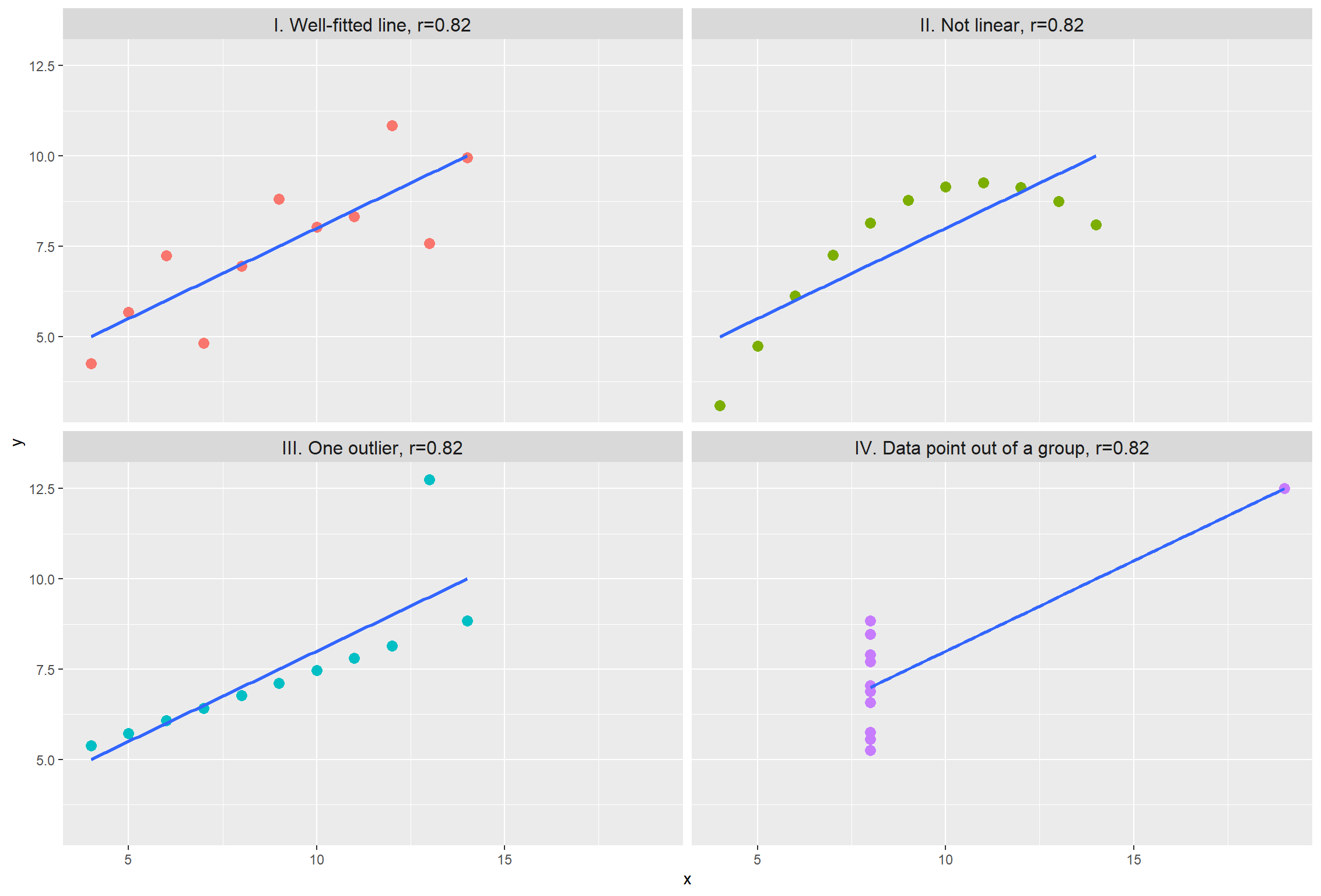
Though all datasets have a Pearson’s correlation of \(r = 0.82\), when plotted the four datasets look very different. Graph I is a standard linear association where a Pearson’s correlation would be suitable. Graph II would appear to be a non-linear association and a non-parametric analysis would be appropriate. Graph III again shows a linear association (approaching r = 1) where an outlier has lowered the correlation coefficient. Graph IV shows no association between the two variables (X, Y) but an oultier has inflated the correlation higher.
Using the data in Figure 9.1 and the Equation 9.1 we find the Pearson’s correlation coefficient r=0.62. However, correlation does not mean causation.
Correlation is not causation
Any observed association is not necessarily assumed to be a causal one- it may be caused by other factors. Correlation indicated only association, but it does not indicate cause-effect association.
As an example, suppose we observe that people who daily drink more than four cups of coffee have a decreased chance of developing skin cancer. This does not necessarily mean that coffee confers resistance to cancer; one alternative explanation would be that people who drink a lot of coffee work indoors for long hours and thus have little exposure to the sun, a known risk. If this is the case, then the number of hours spent outdoors is a confounding variable—a cause common to both observations. In such a situation, a direct causal link cannot be inferred; the association merely suggests a hypothesis, such as a common cause, but does not offer proof. In addition, when many variables in complex systems are studied, spurious associations can arise. Thus, association does not imply causation (Altman and Krzywinski 2015).
Hypothesis Testing for Pearson’s \(r\) correlation coefficient
9.3 Rank correlation (Spearman’s \(r_{s}\) coefficient)
The basic idea of Spearman’s rank correlation is that the ranks of X and Y are obtained by first separately ordering their values from small to large and then computing the correlation between the two sets of ranks. The strength of correlation is denoted by the coefficient of rank correlation, named Spearman’s rank correlation coefficient, \(r_{s}\).
Assumptions for Spearman’s \(r_{s}\) coefficient
The variables are observed on a random sample of individuals (each individual should have a pair of values).
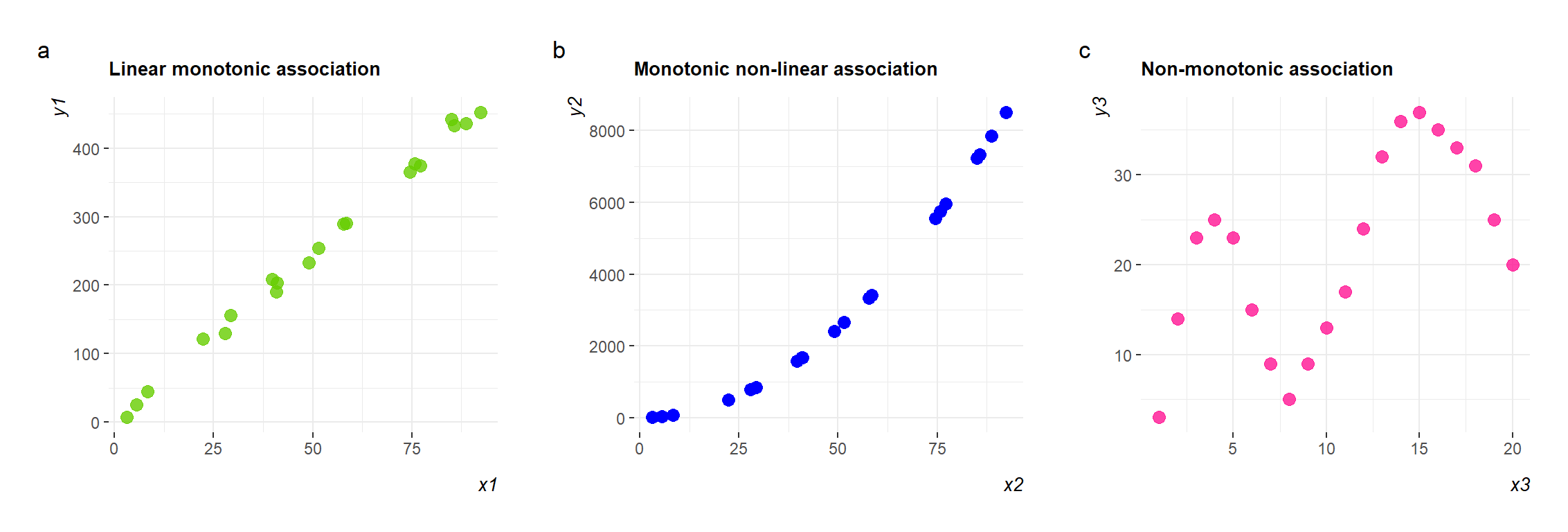
There is a monotonic association between the two variables (Figure 9.6 a and b)
In a monotonic association, the variables tend to move in the same relative direction, but not necessarily at a constant rate. So all linear correlations are monotonic but the opposite is not always true, because we can have also monotonic non-linear associations.
Using the data in Figure 9.1 and the Equation 9.7 we find the Spearman’s correlation coefficient \(r_{s}= 0.65\).